Skip to content

ThisThatThese&Those

Design Blog by Crystal Chou

A design blog about this, that, these, and those.

INFO

About
Contact
Facebook

WORDS FROM THE WISE

"A camel is a horse designed by a committee."
- Sir Alec Issigonis

FFFFUNKY FRESH

5 Old School Mexican Juice Shops in Highland Park That Have Been Juicing Since Before it Was Cool | The Nosh | Food | KCET

CATEGORIES

  • Advertising
  • Architecture
  • Art
  • Blogroll
  • Books
  • Branding
  • Comics
  • Daily Reads
  • Design
  • Design History
  • Design News
  • Events
  • Exhibition
  • Films
  • Findings
  • Furniture
  • Gold Star
  • Good Day
  • Graphic Design
  • Illustration
  • Industrial Design
  • Inspiration
  • logo
  • Magazine
  • Packaging
  • Photography
  • Product Design
  • Random Thoughts
  • Saving The World
  • Stores
  • Toys
  • TTT&T
  • Typography
  • Uncategorized
  • Video
  • Website

Archives

  • October 2012
  • September 2012
  • August 2012
  • June 2012
  • May 2012
  • April 2012
  • March 2012
  • February 2012
  • January 2012
  • December 2011
  • November 2011
  • October 2011
  • September 2011
  • August 2011
  • July 2011
  • June 2011
  • May 2011
  • April 2011
  • March 2011
  • February 2011
  • January 2011
  • December 2010
  • November 2010
  • October 2010
  • September 2010
  • August 2010
  • July 2010
  • June 2010
  • May 2010
  • April 2010
  • March 2010
  • February 2010
  • January 2010
  • December 2009
  • November 2009
  • October 2009
  • September 2009
  • August 2009
  • July 2009
  • June 2009
  • May 2009
  • April 2009
  • March 2009
  • February 2009
  • January 2009
  • December 2008
  • November 2008
  • October 2008
  • September 2008
  • August 2008
  • July 2008
  • June 2008
  • May 2008
  • April 2008
  • March 2008

Tag: logo

Pepsi Logo

image

www.underconsideration.com/brandnew/

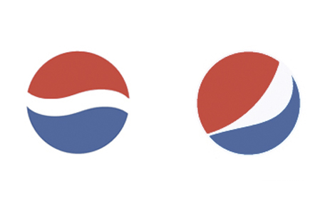
GRAPHIC DESIGN It’s a deformed smile, it’s a funky pac man, it’s pepsi’s new logo!! At first, when I saw this new logo all I could say was “omg, omg, omg”. The new logo is a series of “smiles,” with the central white band arcing at different angles depending on what product it’s on. I think these smiles might work better as animations (like the dairy queen lips) than in print. I don’t think it reads well as a smile…it just looks more like someone accidently deformed the old logo.

Posted on 10.20.200810.20.2008Categories Graphic DesignTags logo, pepsi2 Comments on Pepsi Logo
Proudly powered by WordPress