GRAPHIC DESIGN Exciting news! Eight Hour Day has a new website. Have a great weekend.

GRAPHIC DESIGN Exciting news! Eight Hour Day has a new website. Have a great weekend.
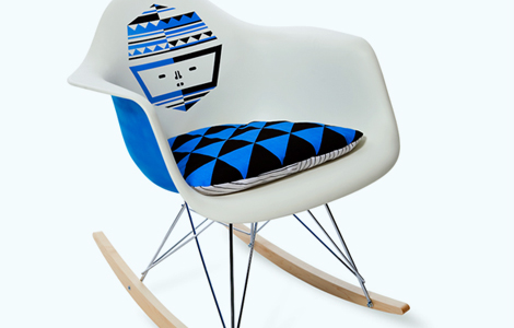
FINDINGS Herman Miller is doing this interesting giveaway. Go enter. I hope I win this chair!!
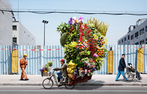
PHOTOGRAPHY Here’s a pretty interesting collection of photographs by Alain Delorme. The photographer comments, “the verticality of these formations echoes the incessant expansion of the urban area, constantly under construction. Here, Delorme gives a new vision full of humor and poetry of those porters – both super heroes and ants with impressive loads of tires, water containers, office chairs, flowers… distanced from the typical photos of china portraying immense crowds, he has focused on the individuality of these workers, as opposed to all those identical and interchangeable objects.”
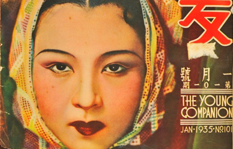
FINDINGS The Young Companion magazine was the first colored variety magazine in Shanghai during the 1920s. The progressive and elegant magazine placed emphasis not only on its insightful articles but also on its great photography that documented the authentic China. I’m kind of diggin’ the art deco inspired logo. You can see some of the magazines in person at the Shanghai exhibit.
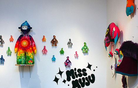
EXHIBITION Giant Robot has a show going on until September 8th filled with amazing art made out of felt. If I had an extra $2000 to spend, I’d buy this.
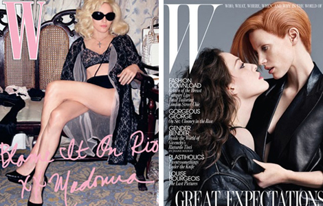
www.observer.comwww.wmagazine.com
MAGAZINE Under the direction of Stefano Tonchi, W magazine has gone through a redesign and introduces some radical changes including a modification of their logo.
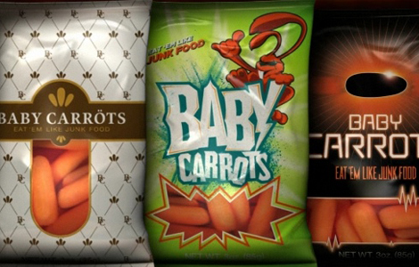
FINDINGS How do you get your kids to eat healthy? Brand it to look like junk food! Looking at these designs just makes me want to stuff my face with cheetos.
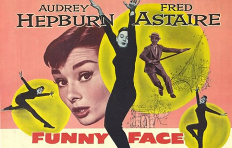
FINDINGS The Stanford Theatre is showing Funny Face starring Audrey Hepburn and Fred Astaire. The talented photographer, Richard Avedon designed the opening title sequence and consulted on the film. Parts of the film reminds me of the editorial work of magazine art director, Alexey Brodovitch. The Stanford Theatre also has a wonderful collection of original movie posters, a great source of typographical inspiration.