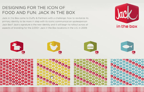
GRAPHIC DESIGN I was not aware that Jack in the Box was rebranding until I saw a commercial today on TV. I was rather surprised by the new look. Though the visual identity system looks very pleasing, I can’t seem to figure out why it feels a little off. Seems like there’s a disconnect between Jack the clown and Jack the new identity.