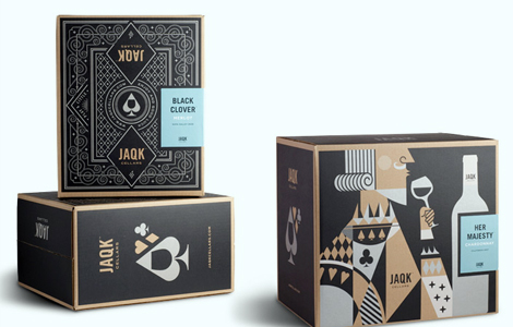
GRAPHIC DESIGN The lovely peeps at Hatch have a brand spankin’ new portfolio website! Make sure to check out their new baby, Jaqk.

GRAPHIC DESIGN The lovely peeps at Hatch have a brand spankin’ new portfolio website! Make sure to check out their new baby, Jaqk.

GRAPHIC DESIGN I was driving by Union Bank the other day and saw that they had done some rebranding. When I saw the new logo I thought at first it was a launch of a brand new bank. I never made the connection that it was just a rebranding of Union Banks old red square logo. In that case, their rebranding was successful. via Brand New.
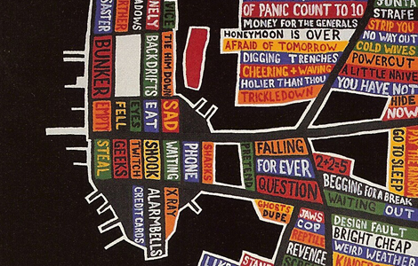
GRAPHIC DESIGN I was reading an interview about Stanley in +81, awesome magazine by the way, and came across this piece he did for Radiohead’s 2003 album. It instantly reminded me of Paula Scher’s giant map paintings. Stanley’s website can be a little confusing to navigate through, but be patient there’s a lot of unique work in it.
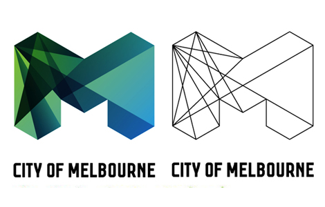
GRAPHIC DESIGN I’m amazed with how well the redesign of Melbourne’s identity came out. It’s tons better than the old identity system. via Brand New
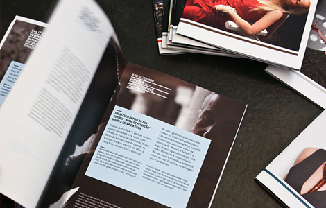
www.behance.netwww.martinojanadesign.com
GRAPHIC DESIGN Martin&Jana is a design group who’s very skilled with arranging typography in a very sophisticated manner. Kudos.
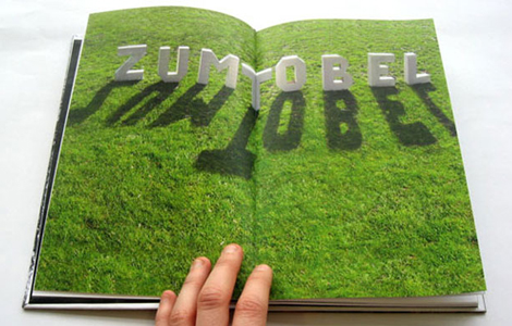
GRAPHIC DESIGN This portfolio is filled with some great pieces that feature amazing 3d typography. And an added bonus, the website itself is designed rather nicely too!

GRAPHIC DESIGN The new issue of Print Magazine asked four design studios to imagine the future of legal pot and how it would be packaged. Featured here is the solution that Base Design has come up with.
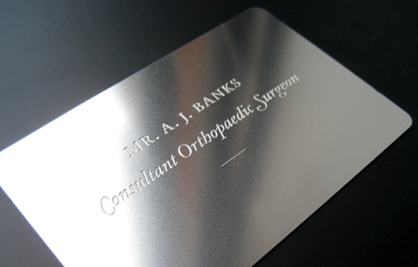
GRAPHIC DESIGN Here’s an interesting business card design for an Orthopaedic surgeon by design studio, Face37. The use of stainless steal was symbolic of the tools used during surgery. This is an interesting concept but I’m not sure I would feel comforted by a stainless steal business card if I were a patient going under the knife.