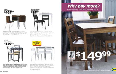
Ikea uses Verdana

image

www.ikea.comwww.npr.org

FINDINGS Those of you who get the Ikea Catalog in the mail might already be fuming with anger. If you’ve noticed, they decided to switch it up a little and change their iconic usage of Futura to the slightly less popular typeface, Verdana. Yucky. “I think it’s mainly experts who have expressed their views, people who are interested in fonts. I don’t think the broad public is that interested.” – Ikea Spokeswoman.

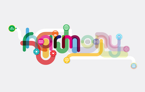
Harmony

image

www.awesome.good.is

FINDINGS If you get the New York Times, you might have noticed a very lovely poster created by GOOD in collaboration with 3rd Generation Prius. Check out their interactive website designed by For Office Use Only. “It’s a look at how different facets of the world—from energy to education to sustenance—affect each other, and how we can keep things in balance.”