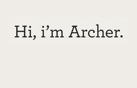
TYPOGRAPHY Is it just me or is Archer the new black? I’m seeing this typeface all over the place…from Martha Stewart to Wells Fargo. However, I’m kind of disappointed with the new Newsweek redesign and their use of Archer for their spotlight section. It’s such a charming little typeface but when used for the wrong brand, it can look really off.
wasn’t it designed specifically for martha?
Yup…and that’s probably why it works so well with Martha’s brand. There’s an article about the typeface here