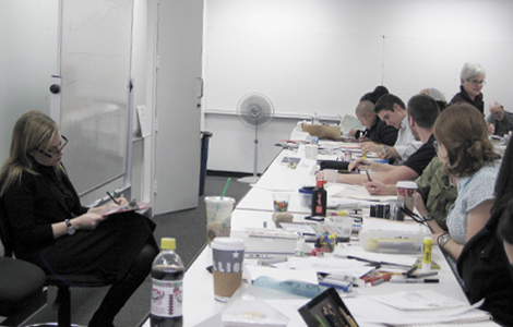
BOOKS I was fortunate enough to take part in an honors workshop held by Debbie Millman at the Academy of Art, San Francisco. It was a delight working with her in person. She will be showing the original pieces that make up her new book, Look Both Ways in an exhibit at the Academy of Art sometime in late winter. I’ll post a reminder later on. So, if you get a chance, definitely try and check out Look Both Ways. It’s a delightful collection of designed essays that takes us into her world of graphic design, art, love, brands, music, life, Levi’s, and much much more.
Month: November 2009
Osh rebranding
LOGO For those of you who live in California, you might have heard of Orchard Supply Hardware. I was looking through newspaper ads today and was surprised to see Osh’s new identity. Do you guys think it’s looking a little too Martha Stewart-ish?
Gobble gobble
GOOD DAY I’ll be taking a little break for a few days. Hope everyone has a gobblicious Thanksgiving.
Robot deer
FINDINGS Check out these remote–controlled decoys used to fight poaching. Officers can now work problem areas by catching violators in the act.
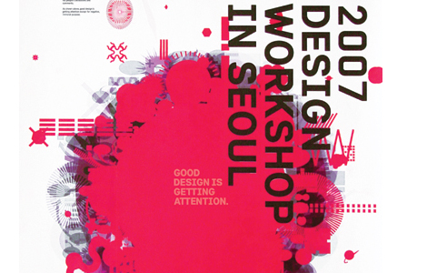
Minsun Eo
GRAPHIC DESIGN I just came across Minsun’s exquisite poster pieces and want to send my congrats to him for receiving an honorable mention for the 2008 Adobe Design Achievement Awards. Job well done.
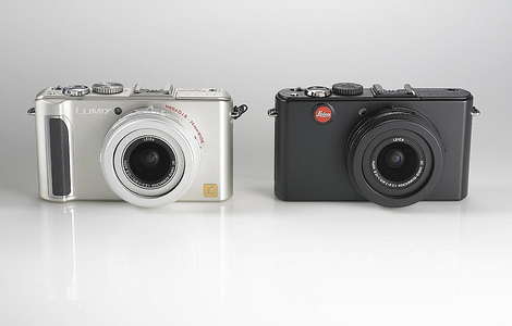
Brand power
BRANDING Here’s an interesting article by Ken Musgrave over at Fast Company. He explores the power of branding by comparing two similar products, the Panasonic Lumix and the Leica. The power of branding can be narrowed down to his last sentence in his post. “When I use the Panasonic, I am taking snapshots, but when I use the Leica, I am making images.”
Chupa Chups
FINDINGS Did you know that the Chupa Chups logo was designed by Salvador Sali in 1969? The logo has not been changed since then and yet still looks modern and fun. Pretty interesting fact, huh?!
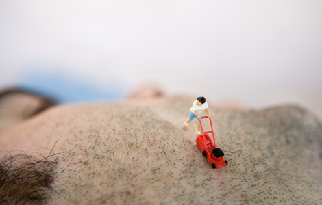
Plastic life
PHOTOGRAPHY This is a fascinating collection of itty bitty plastic figurines. I really want to know how I can get a hold of these toys.
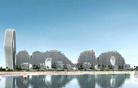
Beihai fake hills
www.archicentral.comwww.i-mad.com
ARCHITECTURE Fake Hills, designed by MAD Ltd., is a brilliant building that will offer residential, office, and hotel facilities located on a waterfront site in Beihai, China. Seeing the organic shape of the building, I automatically think the Great Wall of China. “Rather than sitting the building in a perfect, man-made natural garden, our structure becomes the man-made natural shape itself. The design provides both a high density solution and a new landmark for the city.”
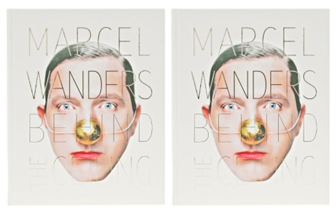
Marcel Wanders
ART Marcel Wanders (i love his name) is a brilliant designer who has been one of my favorites. Here’s a video of him speaking about his designs for the Mondrian South Beach Hotel. The space is breathtaking and feels so dreamlike.