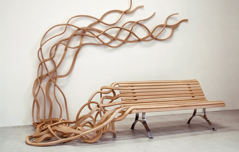
FURNITURE Modern furniture design meets Salvador Dali.
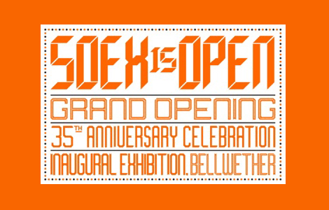
EVENTS Soex is moving into their new space and will be celebrating their grand opening and 35th anniversary on October 16th & 17th. The lovely lettering for their invites was designed by the talented peeps at MacFadden & Thorpe.
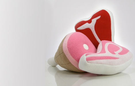
FINDINGS Sweet Meats is the brainchild of Lauren Venell, a San Francisco product designer with butchers on both sides of her family. These awesome meat pillows are handmade in limited editions of 600 and 300 pieces respectively. You can even match them with some meat rugs if you wanna go all out.
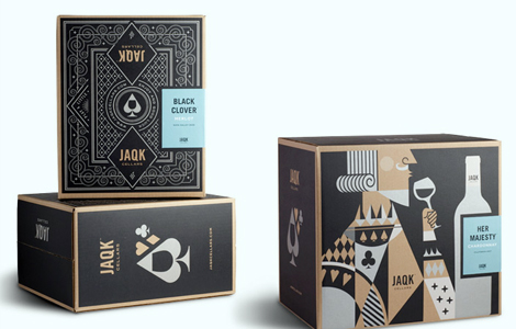
GRAPHIC DESIGN The lovely peeps at Hatch have a brand spankin’ new portfolio website! Make sure to check out their new baby, Jaqk.
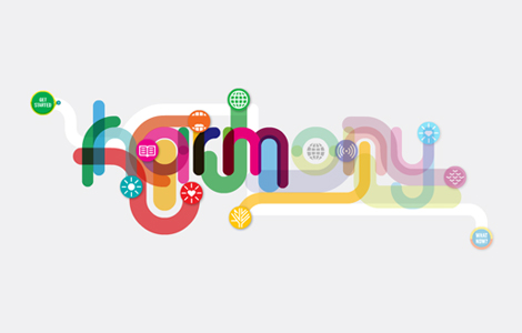
FINDINGS If you get the New York Times, you might have noticed a very lovely poster created by GOOD in collaboration with 3rd Generation Prius. Check out their interactive website designed by For Office Use Only. “It’s a look at how different facets of the world—from energy to education to sustenance—affect each other, and how we can keep things in balance.”
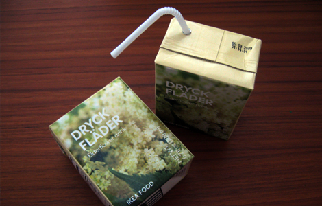
FINDINGS Aren’t these the prettiest juice boxes ever? I came across them when I was shopping at Ikea. They were so lovely I had to buy a pack. They taste nice too.

BOOKS This new book contains a comprehensive overview of the most intelligent, innovative, playful and attractive examples of current packaging design. Keep a look out…it’ll be available soon. Office is featured in the book, too!
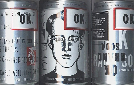
FINDINGS I just came across this awesome soda can while surfing the web called OK Soda. Apparently, it was a soft drink created by The Coca-Cola Company in 1993 that targeted the Generation X demographic with unusual advertising tactics. I want. I want.
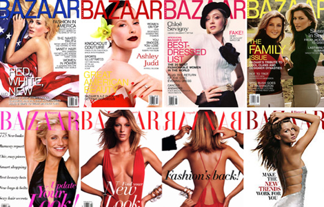
MAGAZINE I was looking through the Nation Magazine Cover Archive and came across a collection of Bazaar magazines. I was surprised to see that they changed a few mastheads into a san serif typeface. I’m so glad they went back to their original serif logo.