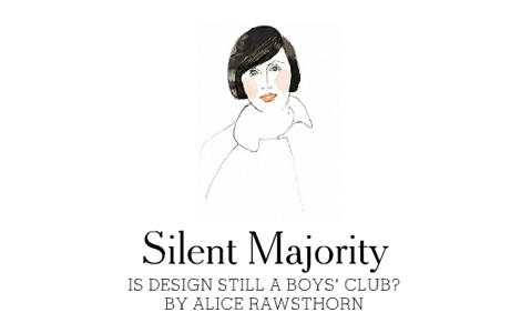
ETC Interesting article commenting on the lack of great female designers. I think there are plenty of stupendous female designers, however, we just don’t know them by name. We know them through their work. Hella Jongerius makes a really true statement in the article, “To make it to the top, you need to be outspoken, self-confident and entrepreneurial, apart from having design talent. I have taught many talented young women and tried like hell to push them, but most were too shy.”
Month: October 2008
paul sahre
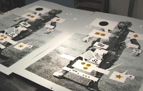
GRAPHIC DESIGN I’d have to say that Paul Sahre is one of my favorite designers. He’s not only a great designer but a really nice person! He’s updated is website with some awesome new work.
Vintage illustration
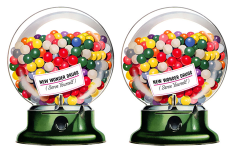
ILLUSTRATION Some lovely midcentury illustrations.
Creative 30
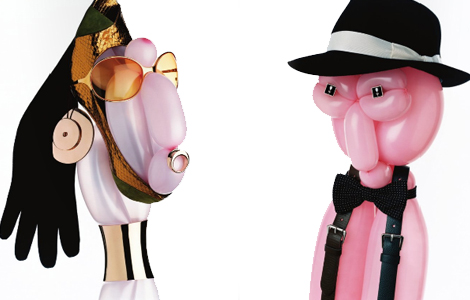
FINDINGS VICE, Volvo, The Independent and Yahoo! have teamed up on a project called Creative 30 which aims to find and celebrate thirty of Britain’s most promising young creative people. Go vote for the creative that you think should win.
City
PHOTOGRAPHY The brilliant City Magazine has just released “City: A photography retrospective”. The book contains a compilation of 10 years worth of glamorous fashion shoots, still-life studies, vibrant beauty close-ups, and cover shots.
Geoffrey Todd Smith
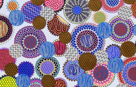
ART This image here by Geoffrey is called “The Diamond Rind of the Ruby Rapefruit”. His other pieces include titles like “Flick the Groom off Your Cake Topper and Turn up the Cyndi Lauper” or “Everything U Fuck Turns 2 Math”. I wonder how the heck he comes up with these titles. His work is an expression of his experiences, memories and interests. He’s compelled to make images to communicate visually with the viewer. “I love engaging in a nonverbal conversation with the viewer that elicits a tangible response to abstract information.” -Smith
Quake quiz
RANDOM Check out this website and learn about earthquake safety. For those of you in SF, don’t forget tomorrow is Shake Up SF, citywide earthquake drill.
Pepsi Logo
www.underconsideration.com/brandnew/
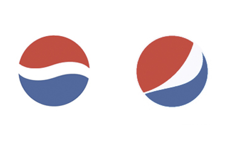
GRAPHIC DESIGN It’s a deformed smile, it’s a funky pac man, it’s pepsi’s new logo!! At first, when I saw this new logo all I could say was “omg, omg, omg”. The new logo is a series of “smiles,” with the central white band arcing at different angles depending on what product it’s on. I think these smiles might work better as animations (like the dairy queen lips) than in print. I don’t think it reads well as a smile…it just looks more like someone accidently deformed the old logo.
1000 Journals Project
EXHIBITION The 1000 Journals Project is an ongoing collaborative experiment attempting to follow 1000 journals throughout their travels. The goal is to provide a method for interaction and shared creativity among friends and strangers. Over 800 pages of journal contributions will be on display at the SFMOMA starting 11/1. There will also be actual journals from the project for you to contribute to.
bank
GRAPHIC DESIGN Bank Associates have a very solid portfolio. Go check them out and see for yourself.