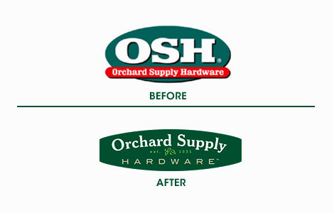
LOGO For those of you who live in California, you might have heard of Orchard Supply Hardware. I was looking through newspaper ads today and was surprised to see Osh’s new identity. Do you guys think it’s looking a little too Martha Stewart-ish?
LOGO For those of you who live in California, you might have heard of Orchard Supply Hardware. I was looking through newspaper ads today and was surprised to see Osh’s new identity. Do you guys think it’s looking a little too Martha Stewart-ish?
I don’t think it’s too Martha, and I might go as far as saying its an improvement (I always hated the old one) but I don’t think it’s as good as it could be. The two main typefaces aren’t really harmonizing, and the established date looks a little lost, like its too close to Orchard Supply. Not terrible, but could be way better.
Totally agree. The little leafy thing also looks too much like a dingbat from some font, huh?
The logo has changed a bit since then… The large text just says “Orchard” with “Supply Hardware” relegated to the small font. Seems like they want customers to start moving from calling the company “OSH” to “Orchard”.