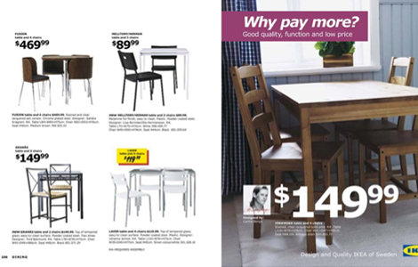
FINDINGS Those of you who get the Ikea Catalog in the mail might already be fuming with anger. If you’ve noticed, they decided to switch it up a little and change their iconic usage of Futura to the slightly less popular typeface, Verdana. Yucky. “I think it’s mainly experts who have expressed their views, people who are interested in fonts. I don’t think the broad public is that interested.” – Ikea Spokeswoman.