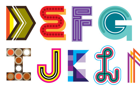
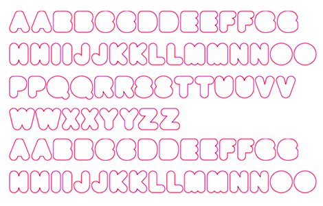
TYPOGRAPHY Here’s a fun alphabet set brought to you by Matt W. Moore.
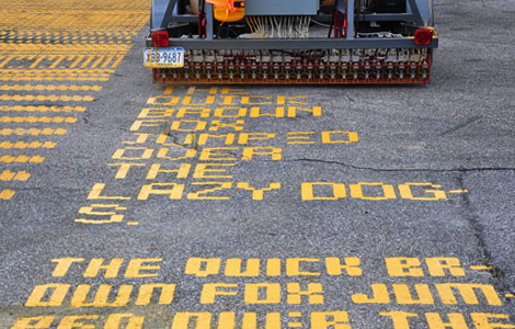
TYPOGRAPHY Own a piece of the road at the Tour de France by writing a message of hope, inspiration, and encouragement. Your message will be sent to the Nike LIVESTRONG Chalkbot.
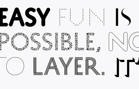
TYPOGRAPHY Here’s a nice collection of typography found throughout the SF Moma. Summer is a great time to make a trip out to the Moma and check out their recently opened rooftop terrace.
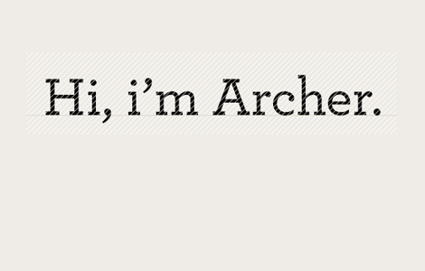
TYPOGRAPHY Is it just me or is Archer the new black? I’m seeing this typeface all over the place…from Martha Stewart to Wells Fargo. However, I’m kind of disappointed with the new Newsweek redesign and their use of Archer for their spotlight section. It’s such a charming little typeface but when used for the wrong brand, it can look really off.

EVENTS Are you freaking out ‘cus you haven’t done your taxes yet? Well, Partners & Spade in NYC is offering some relief to procrastinators by hiring Steve Stojowski, a registered CPA, to help people with their taxes tomorrow from noon to 8pm. You can find him at his office in the storefront window.
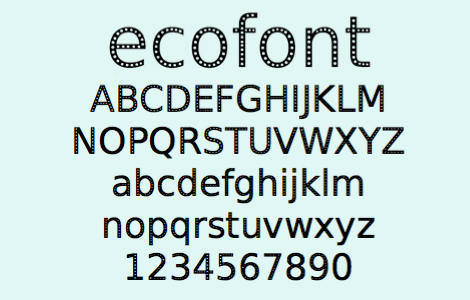
TYPOGRAPHY Spranq is a creative communications agency who set out to design a typeface that would use less ink. As a result, Ecofont, a typeface that uses up to 20% less ink, was created! In the picture you can see how the Ecofont is created by omitting parts of the letter. Obviously, at a large size this typeface is kind of janky, but at a smaller size it is actually very usable.
TYPOGRAPHY Hypefortype is the new online digital type foundry that works together with sought after designers from around the globe to bring us the hottest new typefaces every three months.
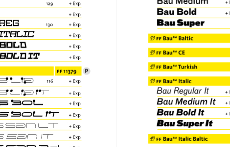
TYPOGRAPHY You can now view FontFont’s 2009 type catalogue online. The printed catalogue is also available for free! All you have to do is send your snail mail address to catalogues@fontfont.com.
TYPOGRAPHY Typotheque has released a program that lets designers select various type characteristics from 21 different faces, allowing one to build numerous type combinations. Now I know what I’m putting on my wish list to Santa!